Monday, April 4, 2011

Lukasz Wierzbowski

I found this photographer through UrbanOutfitters, He's a 26 year old polish photographer who picked up his camera again 4 years ago after many years of not photographing! It's phenomal how brilliant and youthful his work is even tho he's self taught! He's been interested in fashion since he was 12 but then he became a dental technician then he studied psychology and then went back to his photographic roots. I love the energy and youth in his photos. He's an A+ photographer in my book.

This one I chose because of the color punctuation and I'm very drawn to the color red. I love how her square shape pops out of the black couch. The contrast between the red curtain and the white also intrigue me! Also there is a pleasant relationship between the poster and the red curtain that play really well off each other.

The color of the hand is beautiful and serene to me and I hate hands so much, i usually can't look at them. Yes I'm crazy. But the overall photo is so mysterious to me, I interpret there is some metaphorically meaning behind this photo. Maybe like a "down the rabbit hole" kind of thing? I think this photo is so simple but it's loveable from it's nature element.

 I love red. and watching it in a field flowing in the air, covering this woman's face is awesome. The white sky works perfect and it sets a mood to this photograph. I love how much the red pops out of this color scheme. I also love where the horizion line is and the unposed nature of this photo.


here's more of his work! http://sequin-covered-swans.tumblr.com/page/2

Tuesday, February 22, 2011

Alec Soth's assignments

Assignment one: THE TREASURE HUNT.

This photo was taken by this flickr user named mash up. I really like this picture for musuem body guard because it's so typical of what you'd expect of a body guard to do...which is sleep on the job. They must be so bored and he caught that nicely, and i love the fan in the back. Kind of shows how hot and comfortable it must to be int he guard's position. The colors are awesome and his style is more my taste then anything. I checked out his flickr and he's got really great work from the soth's from here to there.

http://www.flickr.com/photos/ramon_mas/5111693019/in/set-72157625109000783/

Assignement two: tell a shorty story

I love this man's story of a guy named jesus he met. It's heart breaking you kind of lose hope in him and yourself a little. He demonstrated a powerful story with just 6 images. My favorite image is the first of the man named jesus and the introduction to his this main character is.

Assignment three: photograph a stranger and have them photograph you.

Andie Wilkinson is the photographer and tho she did not photograph a stranger, this is her friend's child, she took a gorgeous photo of a boy in the woods. I love his expression and body language and the movement of the trees and where he's placed. This is my favorite to look at. And I love that he took a picture of her at the bonfire and it came out too dark. Pretty darn PRECIOUS.

    photo


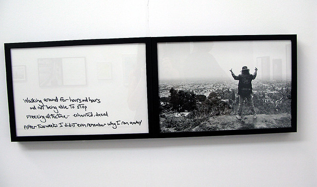
    Assignment four: photograph and narrate with words.


    This is by Jim goldberg, i like that he used handwriting, it's very personal. and this came up on his flickr and  what's written about wandering and running away with this picture of a guy giving the middle finger just matches perfectly. I feel like this man's free and doing what desires to do and to live a life he wants. But i love that after two weeks he doesnt remember why he ran away.


    My impression of these assignments are that they are really interesting a fantastic approaches to photographer and to story telling. I think it's brilliant that he kind of pushes people to show their process and this odd way of using words and having strangers photograph us to convey our journey. I want to do these challenges for myself. Alec Soth is genius.

    Tuesday, February 8, 2011

    Caitlin Price

    Her photo was mentioned in the article and I think Graham was referring to her when he said "how women use our bodies to display who we believe we should be," I think these photos show a sense of these women escaping or having affairs. In this particular photo this woman looks pensive and seems to reflect on decisions she has or will make in my perspective. I love the color of her eyes and how her face/expression is shown clearly.

    This image feels real, I don't think it was set up, I think she just found this tiny woman leaving work or entering some building. I love the sense of space and making people not necessarily the subject but just show what's all around them.This is very linear and neatly presented as a photograph.


    This is from her series called "washed up" which to me, shows these older/out of shape people confidently being photographed while they try to make their bodies look better in the process of tanning. But their younger years when they may have been considered "beautiful" are over but they hang on and keep trying. That's what the name of the series and photos show to me from Price. In this photo I love the colors a lot and the pink speedo and flowers work really well together. This body of work is effective to me but i'm not crazy about all the images.

    Tuesday, February 1, 2011

    Stephen Shore

    This first image, I'm sure is gonna be picked by many other students but how could it not be? The colors are astounding and the detail is crisp and textural. After watching/reading about shore I can definetly appreciate his cropping and decision making skills with this situation presented. The water mimics mountains to me, and the three layers of diagonal lines across the photo are stunning. Probably one of his best in my eyes.


    For some reason this photo really intrigues me, I think it's different compared to what i'm used to seeing from Stephen Shore. I really  enojoy this image tho, I think the use of so many people with his cropping and timing strategy must have been tough to make a decisive moment.I like the mother and daughter mimicing each other with the ketchup and the girl in the red bikini looking right which draws your eye to the right side of the photo.The boy in with his arms crossed also adds some sort of feeling to this photo i can't describe. But he seems to be very appropriate in this photo.

    It's really difficult to find a photograph done by Stephen Shore and pick out the flaws. He's so particular and articulate with his decisions. Eveything is in it's place for a reason with his photographs. So i can't really say what's wrong with his work. But I can tell you that I'm not really moved or inspired by this image.The colors and circles are interesting but compared to his other work, it's not as interesting to me. I think orange inspired this photo (I hate orange) but it's too ordinary for me and doesn't really make stop and think about his decisions.


    Tuesday, January 25, 2011

    Joel Meyerowitz

    I've blogged about this photographer's work, but I really enojoy viewing his street work especially since I love street photography. His angles and perspective reminds me of winogrand and klein (my two street idols.) This image inspires me and is what i look to do with color street work if I ever do it. I love this horozontal wide angle view of these three characters. There's this tint of blue to the dark shadows that i find intriguing in this photograph. I can also sense a comical situation in this photograph with these men and dog.

    Larry Sultan


    Larry Sultan does have strong graphic photos in very subtle ways. In this image, I can sense this feeling of somber and sincerity by the body language and subject matter. But It's not like it's a portrait of a person crying or something intense like that. It's just two elderly people sitting next to each other, confronting one another of something serious. The colors are monochromatic and the yellow pops and makes the image more exciting. Also i like the gold wall paper, it adds this elegance and class to these people. 

    Doug Dubois

     I've had this photographer in my blog before and he is definitely a souce of inspiration to my work or at least my thought process. I love the book this image came from, it's so plain and muted but the red punctuates and adds this interesting mood and egde to this woman. I love the white leaves against the back ground and red. Gorgeous color scheme and he as well as eggleston brings the feeling of home to his photographs.